Anatomy of one project: how I built the IKEA series that got big brands writing to me first
From a childhood memory to the last grain of noise on the image. What the AI did here, what my hands did — and why animation turned out to be the easiest step of them all.
Hi. It's Dasha.
I want to take one of my projects apart step by step — that IKEA series that ended up going seriously viral. I'll break it down layer by layer: where the idea came from, what I looked at before I started, how I drew the sketches, what I did with the generations, how I assembled the frame, how I animated it — and what I did at the very end, when everyone assumes the work is already finished.
Let me be upfront so there are no questions later: this was not a commission. IKEA never paid me a penny, there was no brief, no deadlines, not a single round of client revisions. I came up with it myself, made it myself, posted it myself — and that's exactly why I can break it down in this much detail. There's nothing under NDA here except my own settings, and I'll tell you about those too, as far as I can.
And here's where I want to start, because this one thought is the reason the whole thing is written:
Sounds strange, I know. Everyone usually assumes the opposite: that the hard bit is "bringing it to life", and everything else is just prep. You'll see for yourself where the time actually goes. And where the result actually comes from.
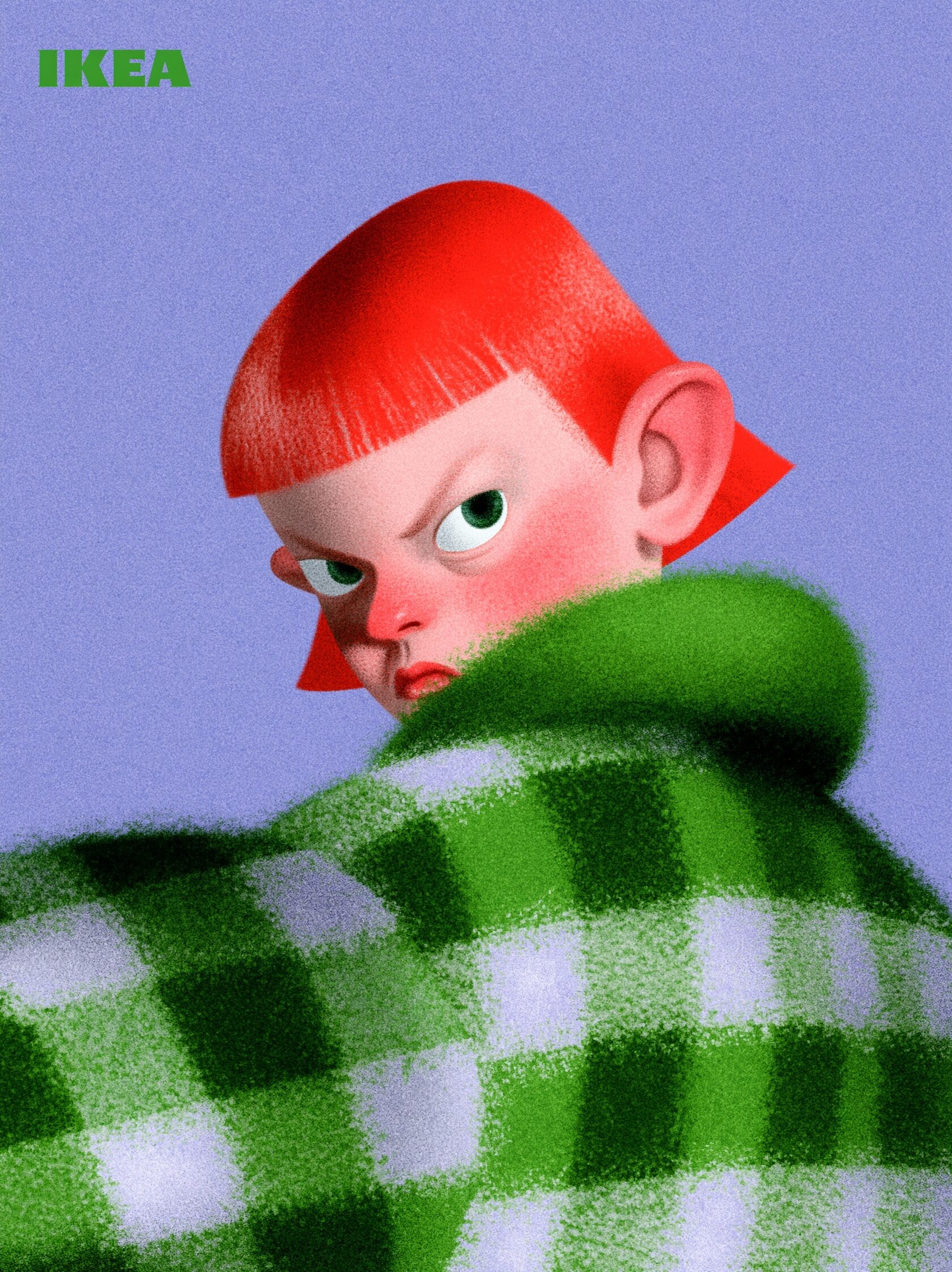
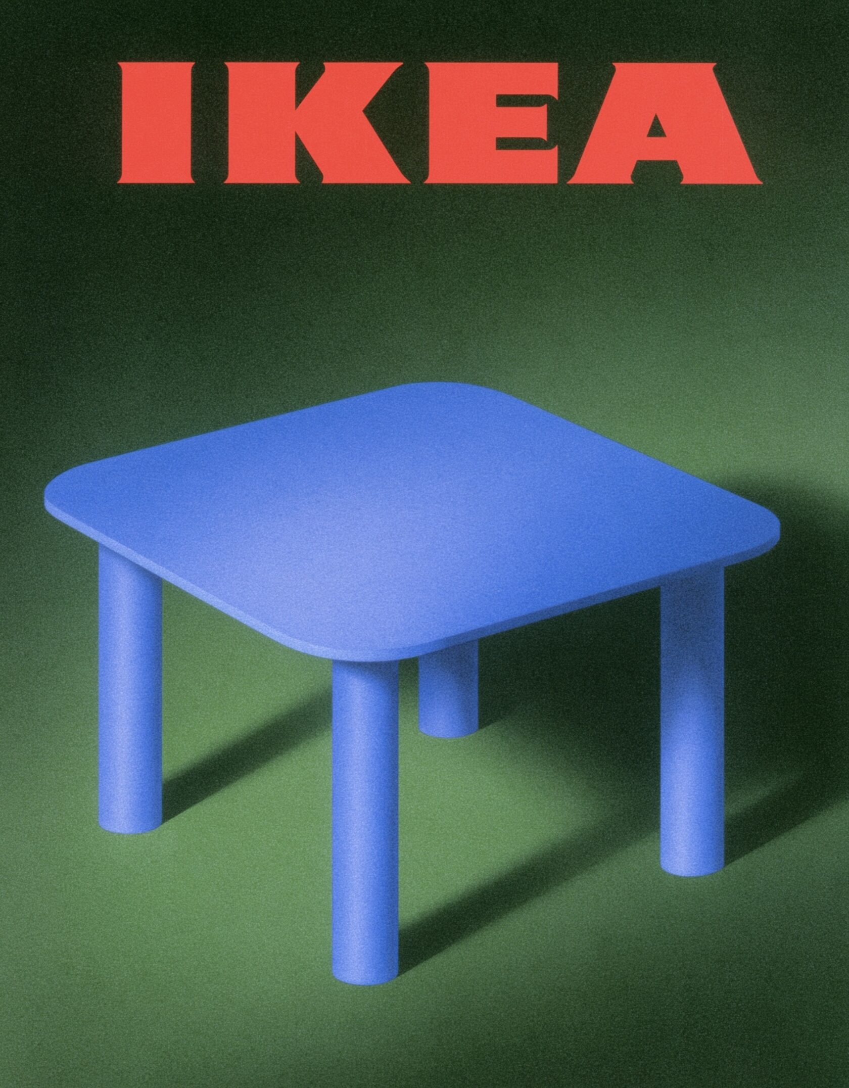
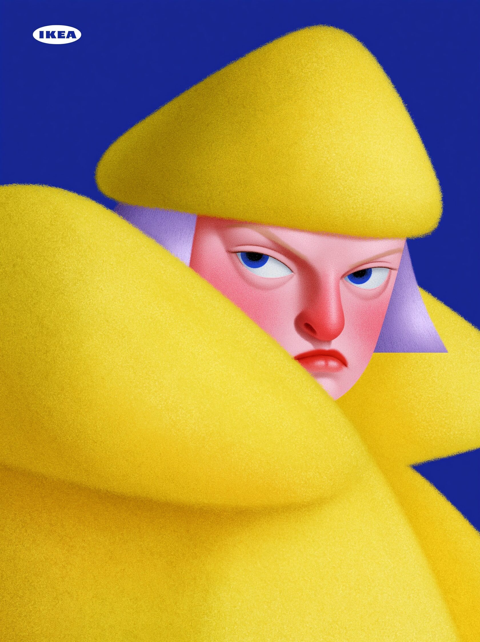
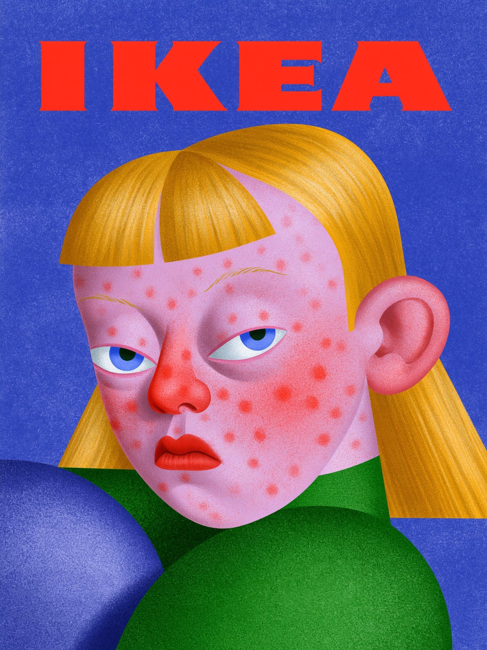
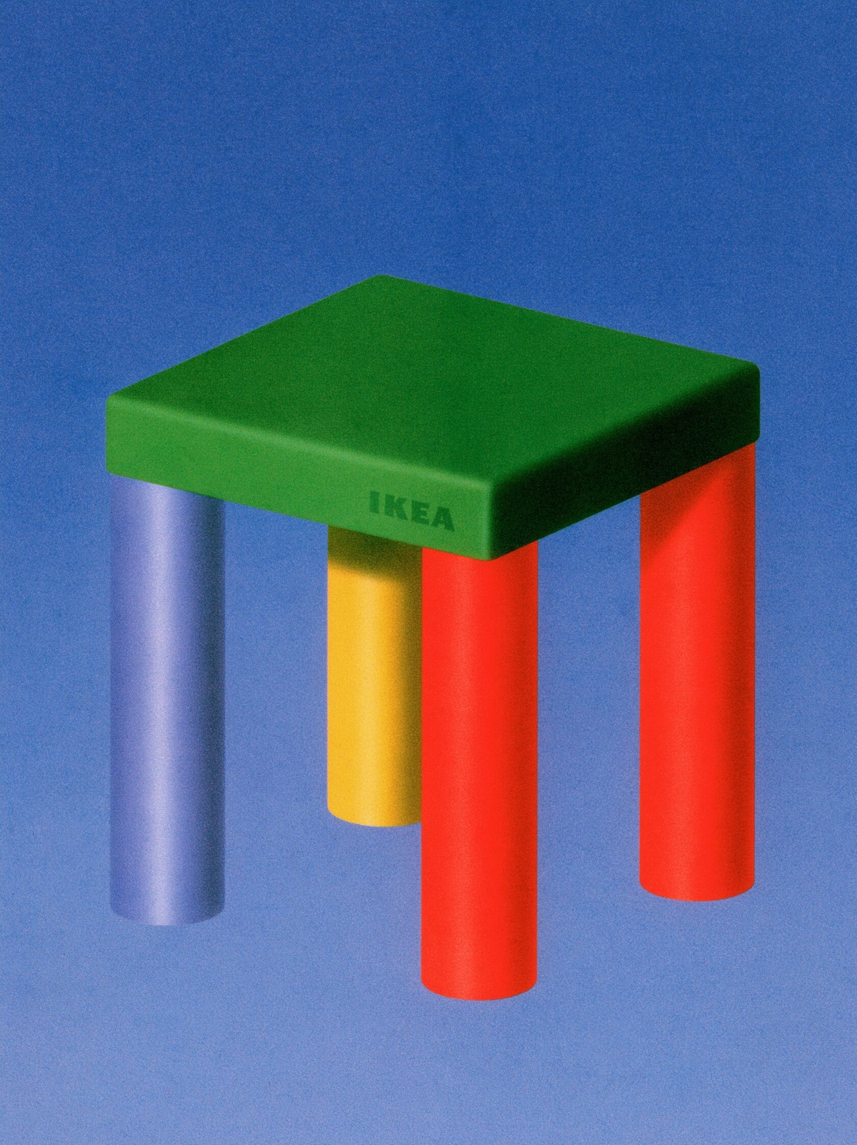
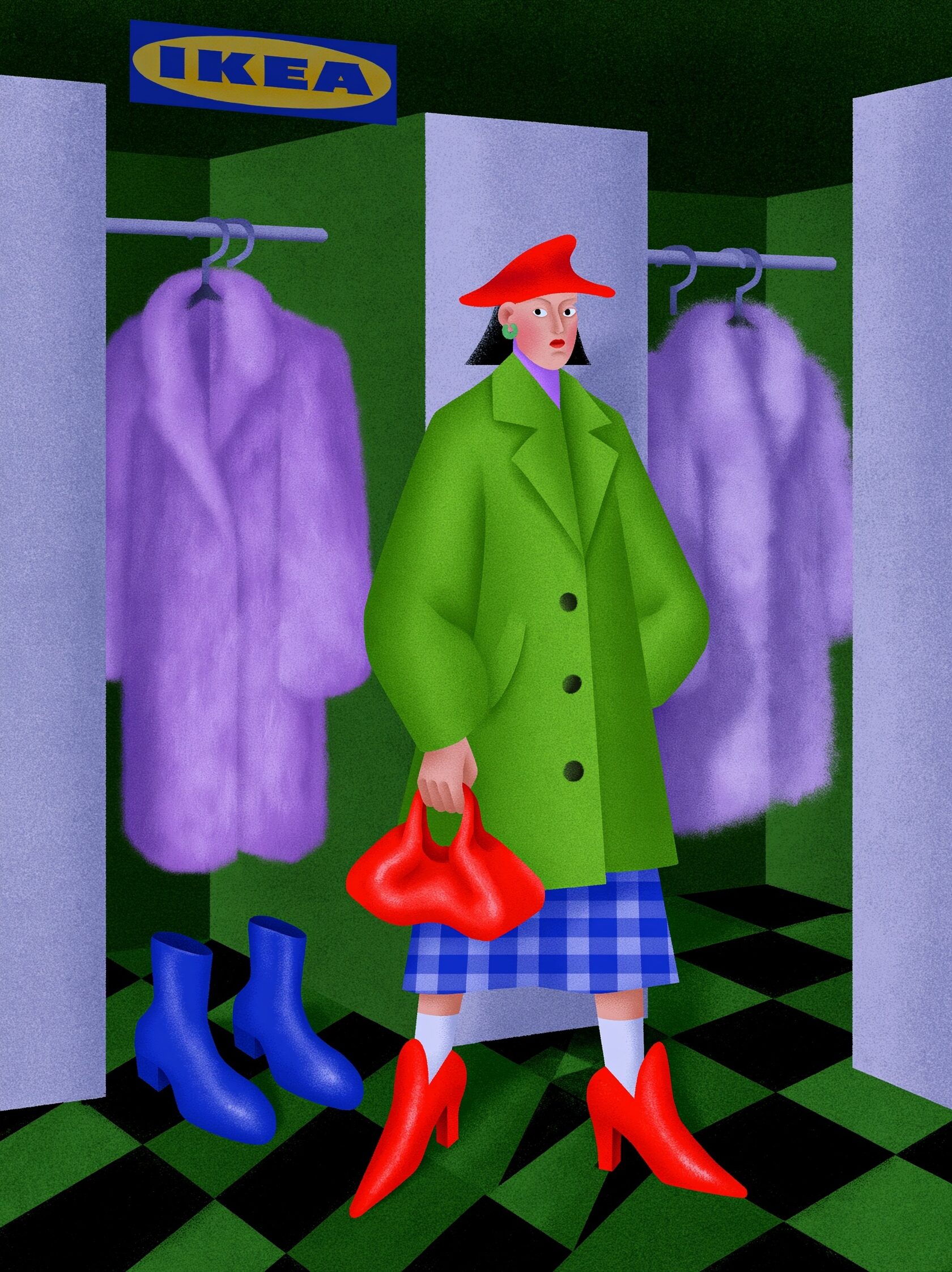
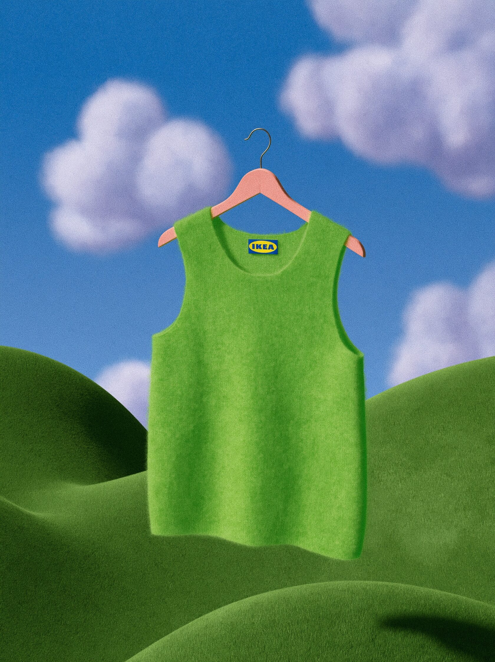
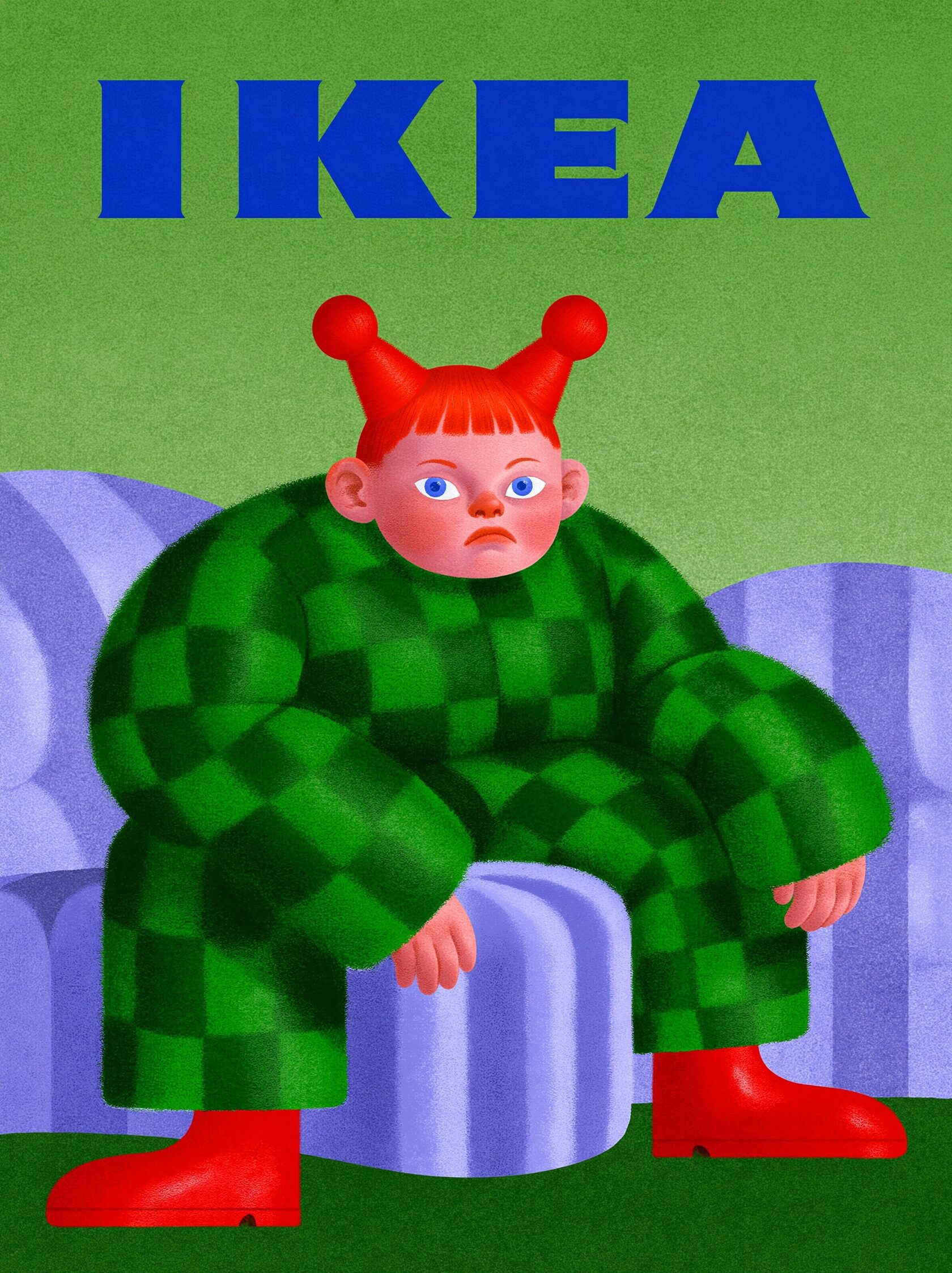
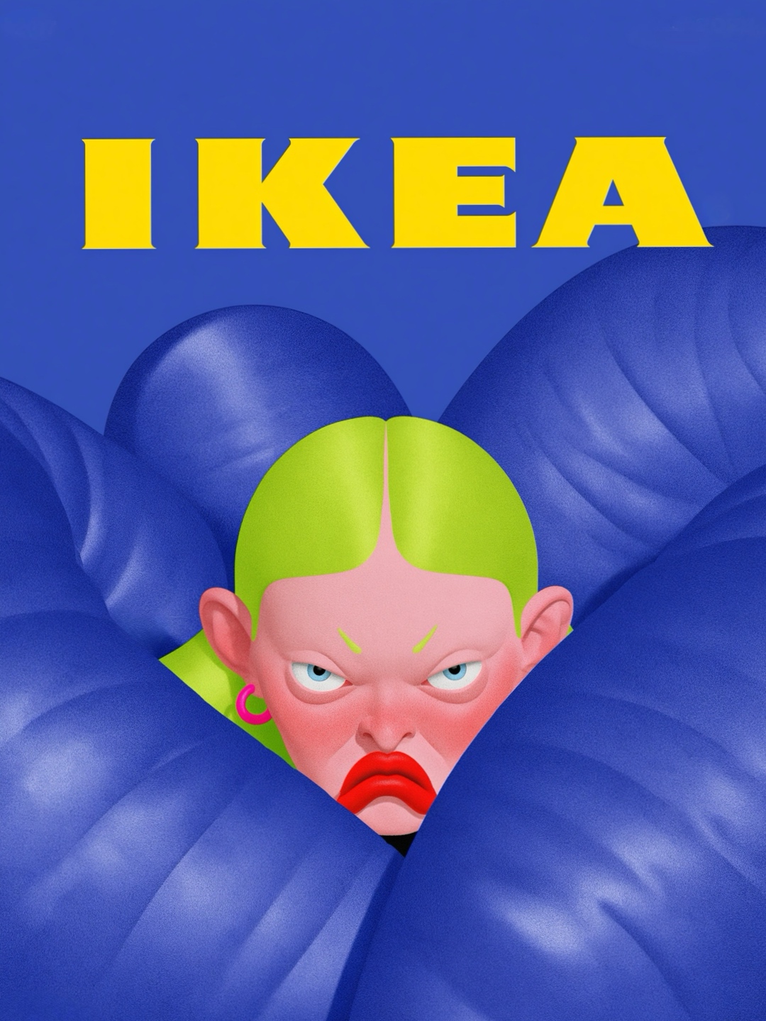
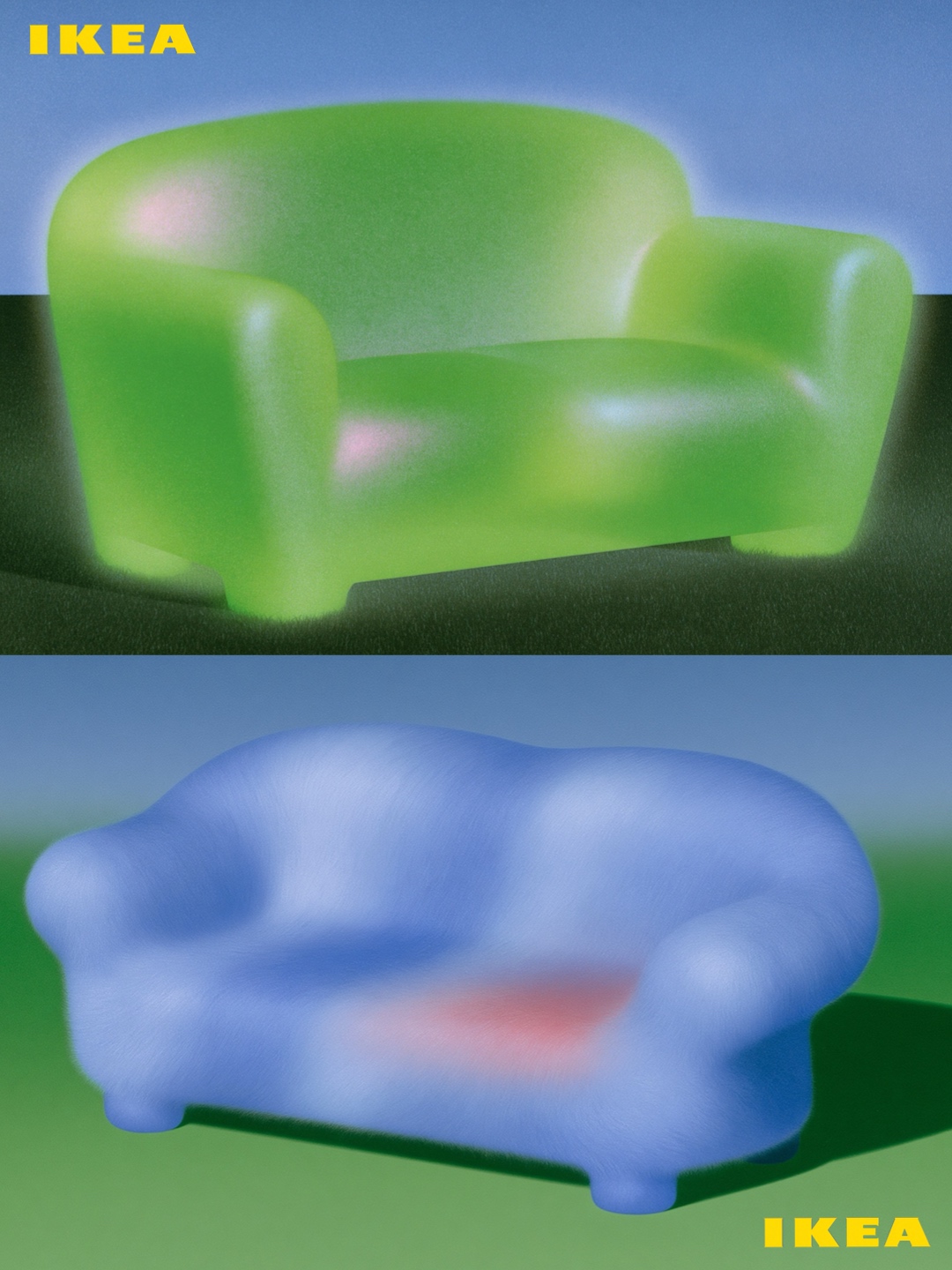
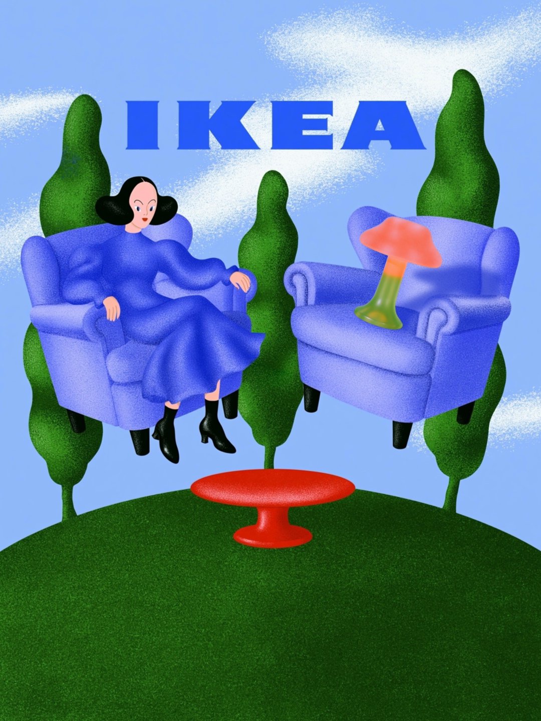
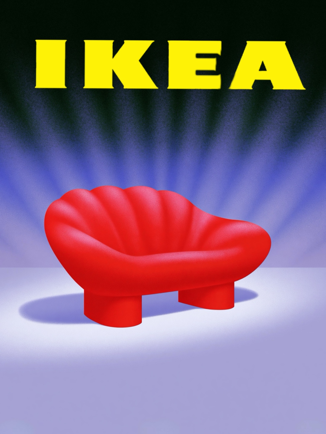
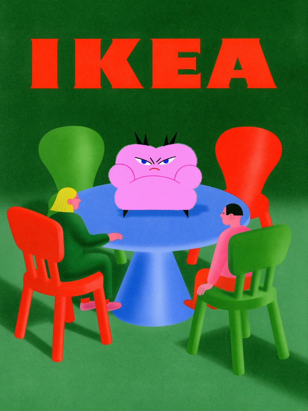
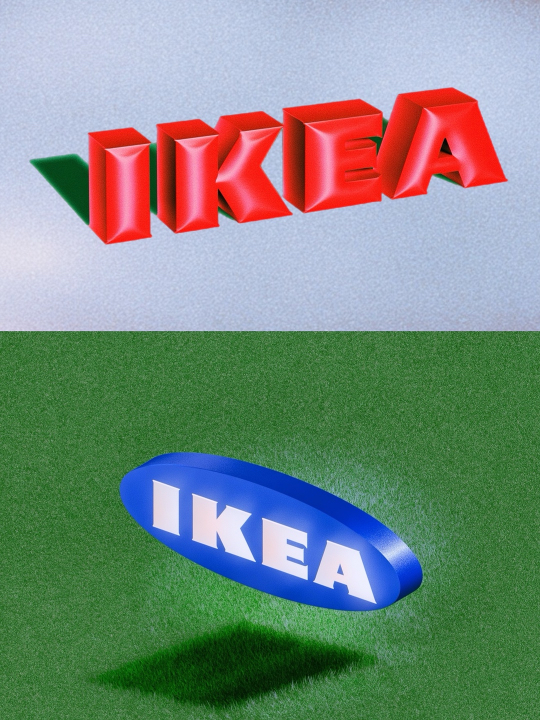
That's one post. No ads, no budget, no client. Plus the commissions that landed in my DMs afterwards — I didn't even count those.
Below you can see the screenshots of the post stats, and now let's go through the work that went in before the post took off like that.
- Where the idea came from — and why IKEA of all things
- References: vintage catalogues and slime from a Chinese shop
- Concept: a list in my notes app and a frozen scene
- A sketch instead of a prompt — the core mechanic
- Assembly: why one frame is four generations
- Post-processing: why I deliberately make the quality worse
- Animation: seeing the frame like an animator
- The takeaway: where the time actually goes
CHAPTER 01Where the idea came from
Let me start with why I picked IKEA at all. There were two reasons, and they're completely different: one grown-up and professional, the other from childhood.
The grown-up one first
I love making creative work for global brands — both on commission and just because I felt like it myself. Images, animations, all of that. But mostly I was picking brands from the fashion industry — simply because it resonated with me, that's where my inspiration was at the time.
And at some point I thought: damn, which brand do I pick to make something cool and actually stand out from all the fashion stuff. I wanted a completely different brand — from outside that industry. But still one that sits inside the things I care about. I thought about it for a long time and landed on IKEA.
That, if you strip away the pretty words, is the actual mechanic of how an idea appears. Not a flash of inspiration. The intersection of three things: what actually interests me × what nobody around me is doing × what I can show the way nobody else can. If even one of those circles drops out, the work comes out either boring, or derivative, or unprofessional.
And now the childhood one
When I was about eight or ten, my parents took me to IKEA. And as a kid I was completely blown away by those rooms — perfect and unbelievably beautiful. I loved that I could climb into all the drawers and cupboards, lie on the beds.
And I told my mum back then that when I grow up I want to be the director of IKEA. Mum laughed and asked: why? Like, what for?
Mum still jokes that this is what made her realise I needed to work for myself.
I'm not telling you this to be cute. Remember that bed — it comes back in chapter three as an actual frame. I just want you to understand: when I say "idea", I don't mean abstract creativity, I mean a very specific personal thing you can pull out of yourself and put into the work.
CHAPTER 02References: catalogues, a flea market and slime
Next — what I looked at before I started making anything.
Vintage catalogues
I've got Pinterest boards full of vintage IKEA catalogues saved. I like that stuff in general, because I work in a collage style and I'm constantly building rooms, building environments for my characters.
And even though plenty of people call it a super conservative brand — I absolutely love their vintage furniture. It's really creative. It genuinely stood out from everything else.
Literally yesterday I went to a flea market and found that yellow moon and star from IKEA there. It was the first thing my family ever bought me from IKEA, something I'd dreamed about. And I still remember their promos, their campaigns — how they pushed those little stars, how they pushed that moon. It still gives me a rush.
Looking back now, I realise: I was always drawn to brands that made unusual content and unusual products. Niche, as people say these days. The kind that actually stood out from the standard mass market.
I wasn't going through the catalogues thinking "what lovely furniture". I was looking at what products existed, and taking inspiration from the textures, the light, the lighting. And separately — from the aesthetic of the eighties and nineties. You'll see it in my work: I took newer styles and combined them with nods to that kind of vintage.
One request though: when you go through the catalogue, let's not cry about the prices. I did tear up a bit, honestly.


The second pillar — textures
I wanted to play with textures. Because my first association with IKEA is walking into the store and being able to touch everything. Pick up the cups, feel them. I always loved their plastic tableware — that matte texture, that tactile feel. The brand was always a very tactile thing to me.
Furniture, toys, cups, chairs, tables — all things we can touch and want to touch. That's what I built on.
And so that when you look at a texture in the work, you immediately know what it is: matte, glossy. So I started thinking about the work from the tactile side, not from the "how do I make it pretty" side.
And then the slime showed up
I have ADHD, I lose focus constantly, and I need something to hold that focus. So I'm always either spinning a bracelet in my hand or fiddling with something else. And recently I came across this slime in a Chinese shop.
I completely lost my mind over the texture and over how nice it is to touch. It holds its shape brilliantly — you press it and the shape stays, it's basically like glue. And it's semi-transparent, which I love. Plus the fun part: when you squish it for a long time, tiny air particles appear inside — they spread through the whole thing and create this matte, gel-like tint.

And that's the texture I used as the base when I was designing the sofas.
I wanted the sofas to be semi-transparent. Half-matte, half-gel. So you'd get the feeling that if someone sat down they'd sink in, but not drop through — the sofa would keep holding its shape. The sharks I made, the tables, the small details — all in that chrome-matte semi-transparent texture. And that's where I combined the slime with the classic IKEA plastic tableware.
Slime from a Chinese shop has absolutely nothing to do with furniture. There isn't one formal connection between it and a sofa.
A reference is not a picture you copy. A reference is a sensation you pull out of one object and transfer onto a completely different one. That's exactly why the work doesn't look like yet another catalogue: half its DNA doesn't come from furniture at all.
🐮🐮🐮CHAPTER 03Concept: a list in my notes and a frozen scene
Next — how I pick concepts. I've got two rules here that I apply every single time.
Rule one: the cut
I always use a storyboard and I always watch the cut. What that means: I never want a series where it's, you know, just people. Or just clothes. I like mixing those little details together.
I love detail in general, it's very obvious in my work — everything is heavily detailed. And I always want to visually enlarge those details. So I write down clearly, in advance, what I need to make. There's no magic to it — here's literally the note this whole series started from:
- my girls, sitting, wrapped up in a rug?
- furniture: rugs, sofas, kids' toys, tables, chairs, potted plants, beds, rooms
- think about vintage style
That's it. Three lines, one of them with a question mark because I hadn't decided yet. But the whole project starts from that list: I know what has to appear in the frame before I've opened a single app.
One exception: if there's a really strong human figure in the frame, I try to leave a lot of air around them. Otherwise — I detail everything.
Rule two: story moments
That's when you look at an illustration and it feels like something is going on. Like something is about to happen. Not just a visually pretty picture, but —
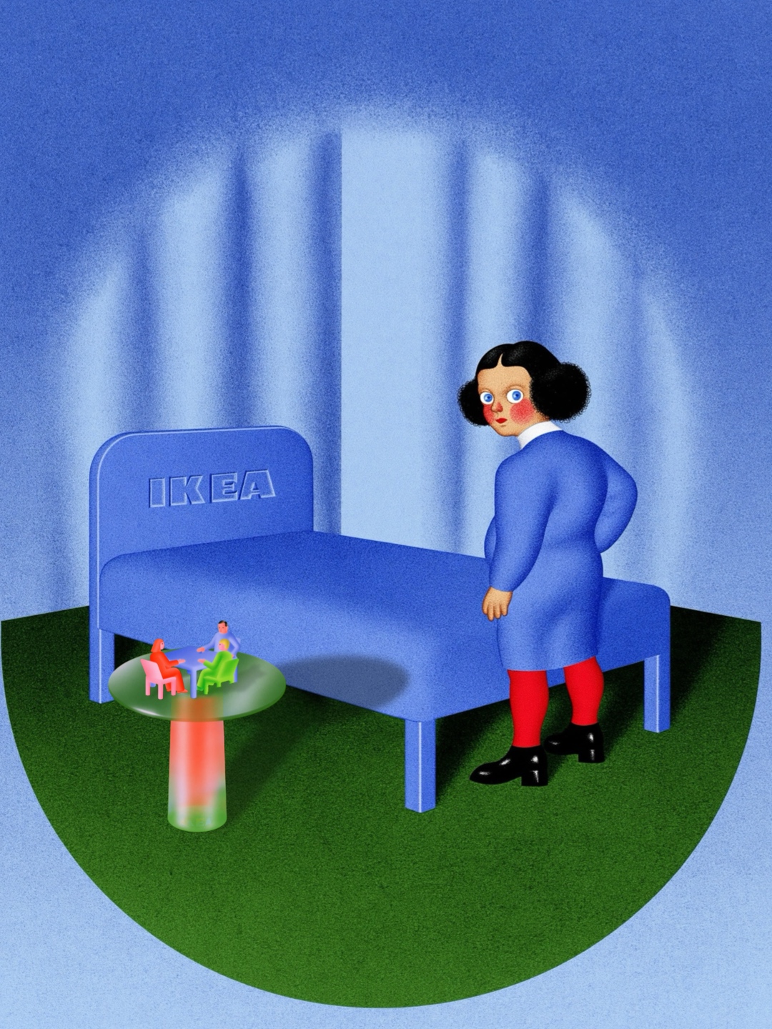
Here's an example. The piece where a girl is standing next to a bed, there's a little table beside her, and tiny people are sitting on that table.
I made this image darker — as dark as it's ever possible to go in my work. And it's a direct callback to my childhood story: the figure is standing there as if she's about to jump onto the bed. Later I animated it too — the figure actually jumps on the beds.
And all around her — the detailed little things, so your eye has somewhere to catch, stop and look at what's going on in there.
That's how a childhood memory from chapter one becomes an actual frame. Not "it inspired me", but literally: the story, the light, the pose, the animation.
CHAPTER 04A sketch instead of a prompt
Now the most important part. How these images were actually made.
I'm deliberately not going to write out "the perfect prompt" here. First, my exact wording and my codes are under a strict NDA, and I honestly can't share them. And second — this one matters more — it isn't about the text of the prompt at all. Let me explain what it is about.
For me everything starts with sketches
Most of my time goes into sketches and rough drawings. And a spoiler right away: you don't need to know how to draw for this. I draw exactly as well as I can draw — and that's it. They're rough sketches, loose approximations of how I want the thing to look in the end.
I think through the shape of the furniture, the shape of the chairs, the design of the rugs. I even draw my girls: their expressions, their poses, the whole idea of how the image will look. I draw in Procreate.
I'll show you on something other than IKEA — a skirt from the Miu Miu kids' collection, a new project I'm working on right now. It's clearer there, because the sketch is extremely simple: literally an outline anyone could draw.
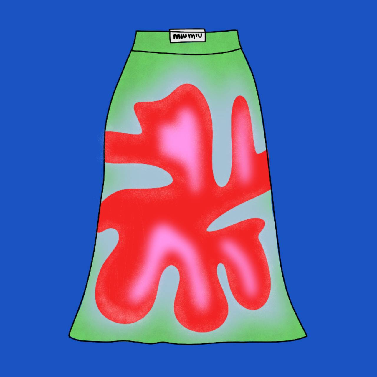
The Edit function in Midjourney: five steps
Plenty of people have talked about the button itself — that you can now change individual things in a generation, green hair to yellow, whatever. What I'm about to give you is how to actually use that button properly. It's fucking brilliant, seriously.
- Draw a sketchAny sketch. As wonky as you can manage. All that matters is that your composition and your idea are in it.
- Load it into Midjourney, into the Edit tabNot into references — specifically into Edit.
- Write a simple prompt. Plain language is fineLiterally: "make me this image" — as if it were a real object. A real skirt, real furniture. No magic words needed here.
- Always add your own sref codesThis is the key part. Skip it and you'll get a realistic skirt exactly like everyone else's. An sref is like dropping a preset over the top. I built my own codes myself in the styles tab, and they're under a strict NDA, so I can't share them. But I hand out a lot of codes to Mobile Creator 3.0 students ;)
- And your profile has to be trainedMore on that just below — it's half the result.
Here's what happens next: Midjourney takes your sketch and finishes drawing it in the style you need. Not its picture in its style — yours, in yours.
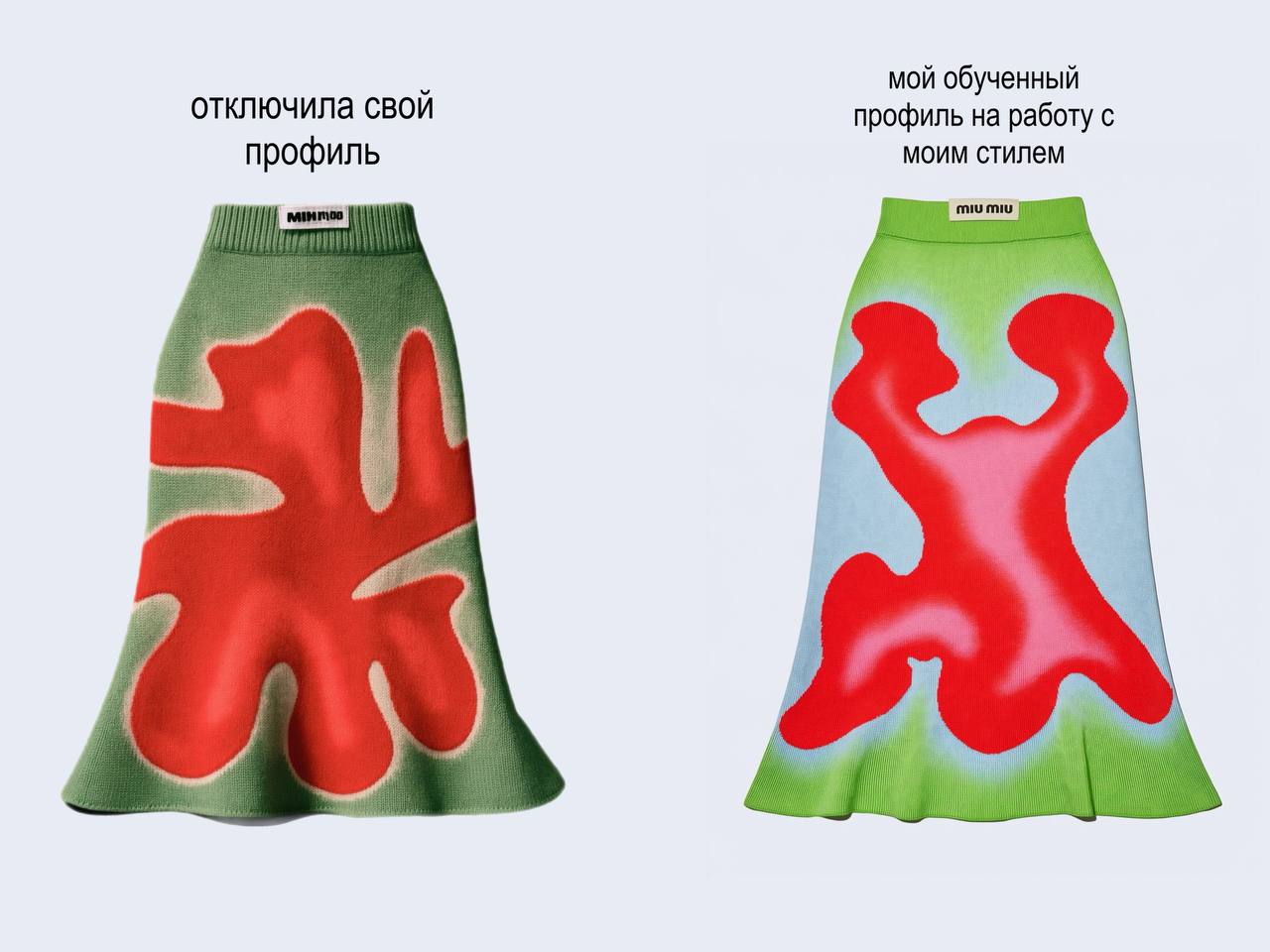
About the trained profile — why everyone ends up with the same thing
I'm certain a lot of people have a profile that's never been trained at all. People just use ready-made codes, ready-made prompts, ready-made everything, and don't spend the time training it.
Here's what that means in practice. Your Midjourney runs on default. Flat-out default: however a billion people train it every day, that's what it hands back to you. Hence the same images, the same compositions, the same everything coming out.
And when you hit the Edit button, your profile is in play too — automatically, you don't get around it. So if it isn't trained for you, it's going to hand you absolute garbage, and nothing good is going to come out of it.
Training your profile really matters. It's boring, it's slow, it doesn't pay off on day one. But it's exactly the line that separates your work from everyone else's.
And honestly: this is not a magic pill
Even with my own sketch, my own codes and a trained profile, Midjourney gives me a slightly rough result. Every time. And then I start refining it — that's the next chapter.
By the way, I have three styles and I mix them together: a darker one; a combo of realism with very bright colours; and a new one, a sketchy one with a vintage note to it. I generate my girls in that third one, or sometimes just draw them myself, because the drawing style is light and I can more or less reproduce it.
It isn't just me getting results this way. Over a thousand students are learning this exact approach — from the idea all the way to the final post-processing — on Mobile Creator 3.0, and plenty of them are already taking on brand work. Here's their work and their reviews.
CHAPTER 05Assembly: one frame is four generations
I very rarely leave generations the way they came out. Almost never.
Sometimes the logo generated crooked, sometimes something needs redrawing. But usually the reason is different: I work in collage, and collage by definition means several images joined into one.
Let's take that frame with the bed apart
At first glance it's one picture. In reality it's three separate generations plus manual work:
- The girl with the bed — a separate image.
- The people sitting at the table — a separate image.
- The table itself — also a separate image.
I cut all of that out, added shadows and merged it together. There's a sofa sitting on top of it too — it's in a different style and was generated separately from the image itself. And I wrote the logo by hand in Procreate, it's just drawn over the top.
So in one frame: four generations, cutting out, shadows, hand-drawing. And that still isn't the finish line — post-processing comes next.


And one more, smaller example
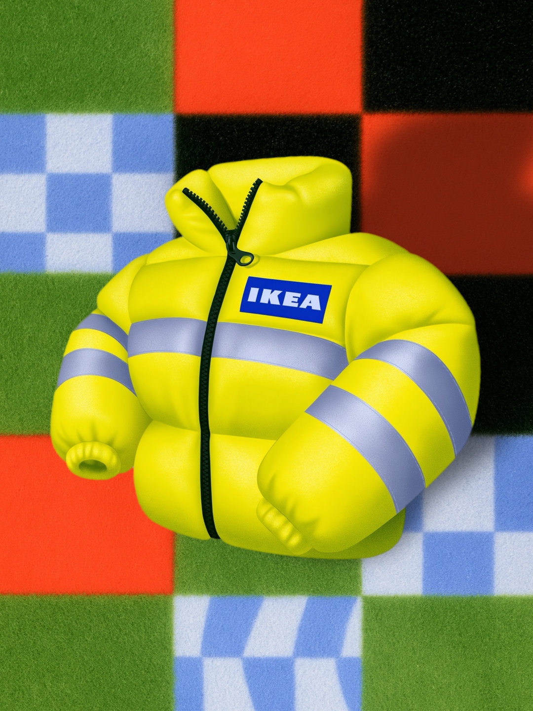
There's a piece with a jacket on a checkered background. That background isn't actually a background. It's a rug — a rug I designed myself, with that texture where those little fibres came through. I just took it and used it as a background. And laid a jacket over the top — a workwear one. I thought it would be really fun if IKEA delivery guys wore that jacket.
That's what the work is made of. Not one brilliant decision, but twenty small ones, where an element made for one job suddenly turns out to be perfect for another.

CHAPTER 06Post-processing: why I make the quality worse
This is the part I consider one of the most important of all. And the part I think the entire future of AI is going to hinge on.
People assume: the generation came out of Midjourney, done, it's ready, take it and post it. And that's exactly where the problem starts.
Why generations all look the same
Every neural network spent a very long time training on realism. That matters. So they'll always hand you hyper-realism, or what I call "sharpness cranked up" — where the quality is pushed to the maximum so the picture supposedly looks better.
And the future in AI is precisely the opposite. It's in reducing that quality. In reducing the quality of the post-production specifically.
A simple sanity check. You photographed some food while you were having breakfast. Before you post it on Instagram, what do you do? You open some app, drop a preset or a filter on it, adjust the colour. So you're refining even a real photograph.
What I do with every image
First the non-negotiable part — the thing without which a collage simply won't glue together. When we take a hand from one image, a table from another, a sofa from a third, all those pieces arrive from different stylistic approaches and with different colour grades. So:
- I match the colour grade. So all our images become the same in colour, so they even out in quality too. This isn't decoration, it's the condition for the collage reading as one image instead of a paper cut-out.
- I drop a filter over the top. The filter sets the style of the image and — most importantly — evens out all our different, different pictures and gives them one single vibe.
And then come my personal things:
- Glow. Everything light in the image, I light up further. So the picture looks a little bit magical, you know, with a bit of haze to it.
- Grain and noise. I load it over the top.
- Lowering the quality. Yes, deliberately. I always bring my images down slightly in quality — so it reads like an actual printed poster.
- A final filter — depending on the vibe of that particular piece. Could be more vintage, could be darker.
Take any generation you made recently. And drop a filter on it in CapCut. Just look at how much the image changes. You're going to lose your shit over your own result — it'll look completely different, properly elevated.
🐮🐮🐮People get taught to generate. But people don't get taught to work with the result properly afterwards, to do the post-production. And that's exactly the difference between images that look like somebody's work and images that look like AI output.


CHAPTER 07Animation: seeing the frame like an animator
Now for animation. And there's a really important thing here that everything else starts from.
Here's the difference. When someone doesn't see like an animator, they usually write super short prompts and lean entirely on the AI. And if you add up all the animations people are making right now, they're mostly standard, default animations with none of you in them at all. The AI animates the way it understands it and knows it, regardless.
Let's cross out "writing prompts" altogether
I don't want you fixating on the idea that you'll write some text and it will understand you. It won't understand you. It will only understand you once you start training your Midjourney to animate exactly the way you see it. Midjourney has to be taught animation too.
And if you don't know how objects move yourself — if you don't know at least three of the twelve principles of animation, the most basic ones — your Midjourney is going to add loads of facial movement and all kinds of weird things, weird actions. Because somebody has to make the decision about what exactly moves. And if it isn't you, it's him.
Why a complex composition breaks the animation
Look at other people's cartoon animations — you'll notice they very often use very simple visual devices. I'm not devaluing anyone's work here, I just want you to see visually what I mean.
A princess sits brushing her hair, blurred background behind her. Next frame: a teacup standing there, a hand pouring the tea. Those are easy visual compositions — and that's precisely why they come out well.
Now put that same cup not on a table but on grass, with a forest all around it, and the girl has to walk over to the cup, pick up the teapot and pour. That's it — compositionally this is already hard. Now you're going to get fucking butterflies flying out of the forest, and god knows what else. You'll get enormous movement, chaos in every direction. Simply because you never told it what was supposed to stay still.
The job of a prompt is not to describe movement but to limit it. For example, so that only the eyes move. That is very hard, trust me. Take my detailed image where the girl jumps on the bed and just hit the button — you'll get a somersault around her own axis, and on top of that the whole thing can go off in absolutely any direction.
What I do
I animate most of it by hand. I've been making animation on mobile devices for over seven years, and the difference is that I already see the frame like an animator — I can sit down and animate it myself. That's how I made the sofa that bounces like a ball, for instance.
That's my favourite animation device, by the way: squash, release, stretch. I use it constantly.
Sometimes I animate through Midjourney — but my profile is very, very heavily trained on all sorts of animation, so whatever text I write, it already roughly understands what I want from it.
And the main thing I want to stress
A lot of people bet specifically on the animated action — there's a whole thing going on, the girl walks, puts down a table, loads and loads of stuff happening — and the visual side suffers for it.
I put much more into the visual side and make a basic, vibey animation. And when I am revealing a story, the story reveals itself through light animation. For instance, I recently made a music video for a girl: there's a micro-story at the start where flowers gradually light up under her track. That's all. No complex mechanics — but the vibe lands.
CHAPTER 08The takeaway: where the time goes
Let me come back to where I started.
If you've read this far, you've probably already noticed it yourself: animation is the easiest thing that exists in visual work. The hard part is exactly that — coming up with the ideas, gathering the references, building the composition, pulling that whole composition together into one thing.
You spend an enormous amount of time assembling the composition, and then you animate it in, what, an hour, to exaggerate it. This matters hugely when you're planning the work and when you're pricing it.
on my sketch
What I want you to take away from this
- An idea is not a flash of inspiration. It's the intersection of what interests you, what nobody is doing, and what you can show.
- A reference is a sensation, not a picture. Slime from a Chinese shop turned into a sofa because I was looking for tactility, not for furniture.
- Talk to the AI in pictures, not in words. Sketch + Edit + your own srefs + a trained profile give you your result. A prompt on its own doesn't.
- Always do the post-production. You retouch a photo of your own breakfast. A generation, all the more so.
- Limit the movement. Good animation is usually not "lots of action", but one precisely chosen small thing.
And one last thing. I'm a big believer in refining our generations.
I deliberately took one project apart almost frame by frame: the idea, the references, the sketch, the generations, the assembly, the post-processing, the animation. And I still hit the ceiling of the format — an article can show you the logic, but it can't show you how I rebuild the same frame twenty times over until it finally sits right, or how a profile trains on my work across months rather than in one evening.
You only really learn this by doing it yourself — next to someone who has already walked that path and can tell you: this bit's off, try it like this instead.
That's exactly what I built Mobile Creator 3.0 for — my main programme and the most honest one I've made in all these years. This isn't a "press the button, get the result" course: there are lead mentors on the programme who walk students through by the hand, and we go the full path instead of skimming across features.
A huge part of the programme is idea generation and how to bind references into one coherent composition. That's the single biggest chunk of labour in any project, and it's exactly what I teach separately and in depth. We focus on the foundation that sits behind every piece of work — and it's that foundation that makes work the kind brands come looking for. My students get commissions from major brands not because they learned which buttons to press in Midjourney, but because they went through the whole path.
It's my pride, and it's the deepest, most complete thing I've ever taught.
90 days from the fundamentals of mobile animation to AI tools — with a portfolio, feedback on your own work, and your first brand commissions. Two formats to choose from:
